MuseScore bug: Weird UI text when font smoothing is not disabled
Update: While this behavior was exhibited in the 3.0 pre-release, released versions of MuseScore 3.x behave normally.
Background
Font smoothing is disabled by default at the OS level on macOS Mojave, which makes font rendering look worse on non-retina screens. A workaround for this OS-level issue is available.
To restore the font smoothing behavior of older versions of macOS, run this command, log out, and log back in:
defaults write -g CGFontRenderingFontSmoothingDisabled -bool NO
To revert to the Mojave default, run this command, log out, and log back in:
defaults write -g CGFontRenderingFontSmoothingDisabled -bool YES
I use a non-retina external display and a non-retina Mac, so I re-enable font smoothing so text doesn’t look blurry.
Steps to reproduce
OS default font smoothing
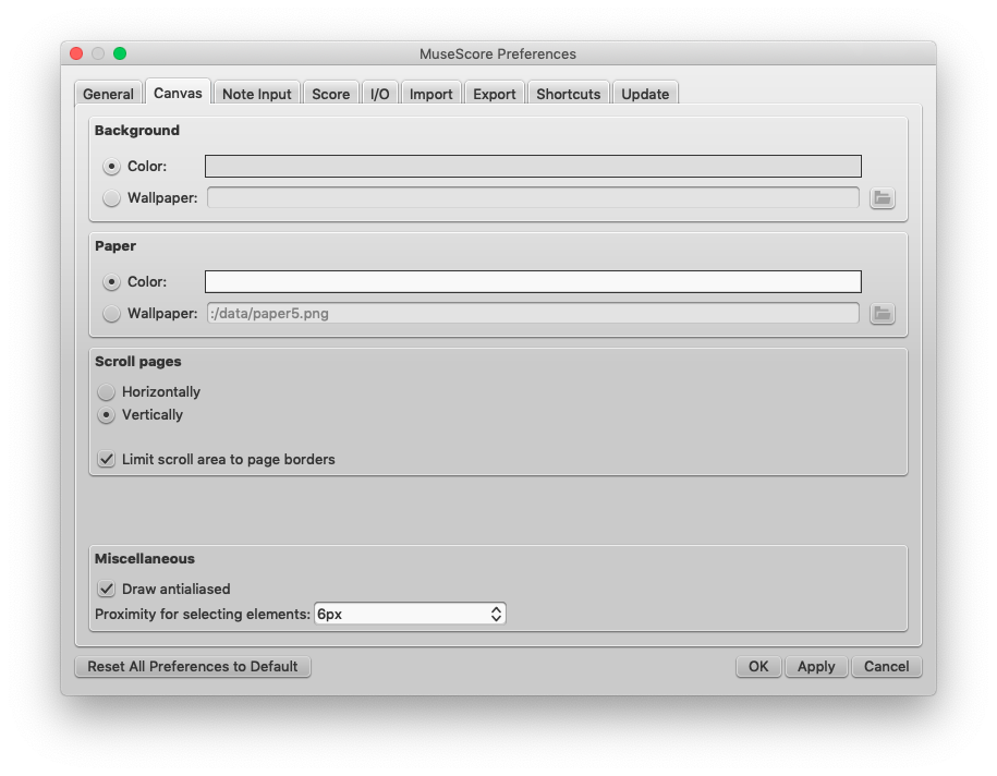
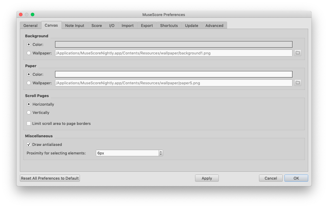
With the default Mojave font smoothing behavior (setting YES), both MuseScore 2.3.2 and the MuseScoreNightly-2018-12-21-1923-master-12d0e18.dmg build render UI text reasonably. Screenshots are attached.
2.3.2 Behavior

3.0 Behavior

Font smoothing not disabled
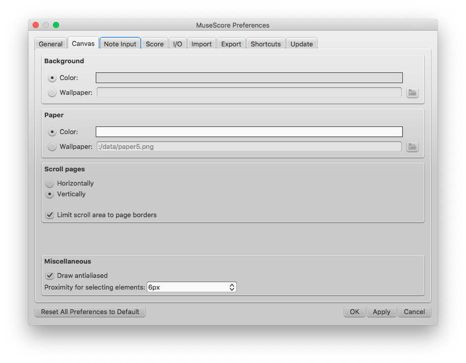
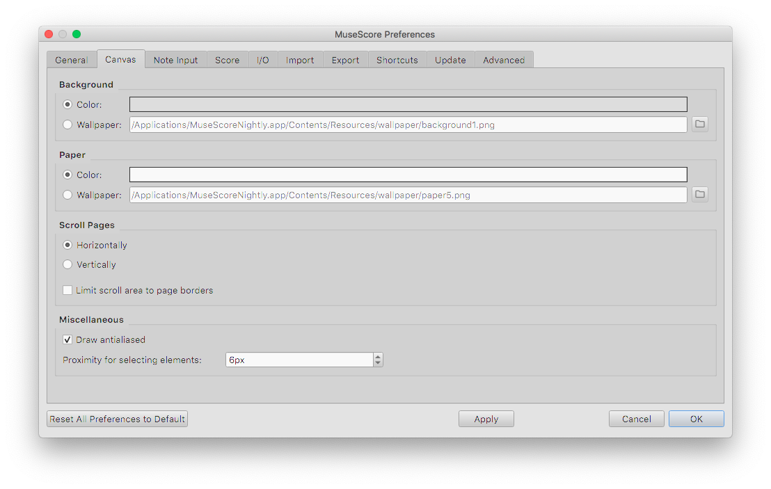
With font smoothing not disabled (setting NO), MuseScore 2.3.2 renders UI text reasonably but the text looks crunchy and weird on the 3.0 nightly build. Note the correct text rendering in the 3.0 screenshot’s title bar but weird text in the dialog space itself.
2.3.2 behavior

3.0 behavior

Workaround
The workaround is to disable font smoothing, which is undesirable as UI text everywhere in the OS looks blurry.
This blog post is also available on the MuseScore issue tracker as issue 280452.